26 August 2015

A memory-filled gallery wall


In our first house, I struggled endlessly with what to do with the big wall in the dining room. It was an awkward wall with some weird bulkheading going on so it didn’t really have a defined middle. This past winter, I finally figured it out and hung a gallery wall with pictures of favourite memories:

Old house gallery wall

I loved that wall. My chair in the dining room faced it and there was a good view from the kitchen. It felt very home-y, but modern at the same time, which was exactly what that house needed. When we moved, I took it down without really knowing whether there would be a place for it in the new house (*tear*).

After we painted the dining room, it started to feel a lot more like our old dining room, and I started to feel like the gallery wall would work in there. Justin didn’t believe me, but I was convinced and hung it anyway while he wasn’t home. And wouldn’t you know, we both love it!

New gallery wall

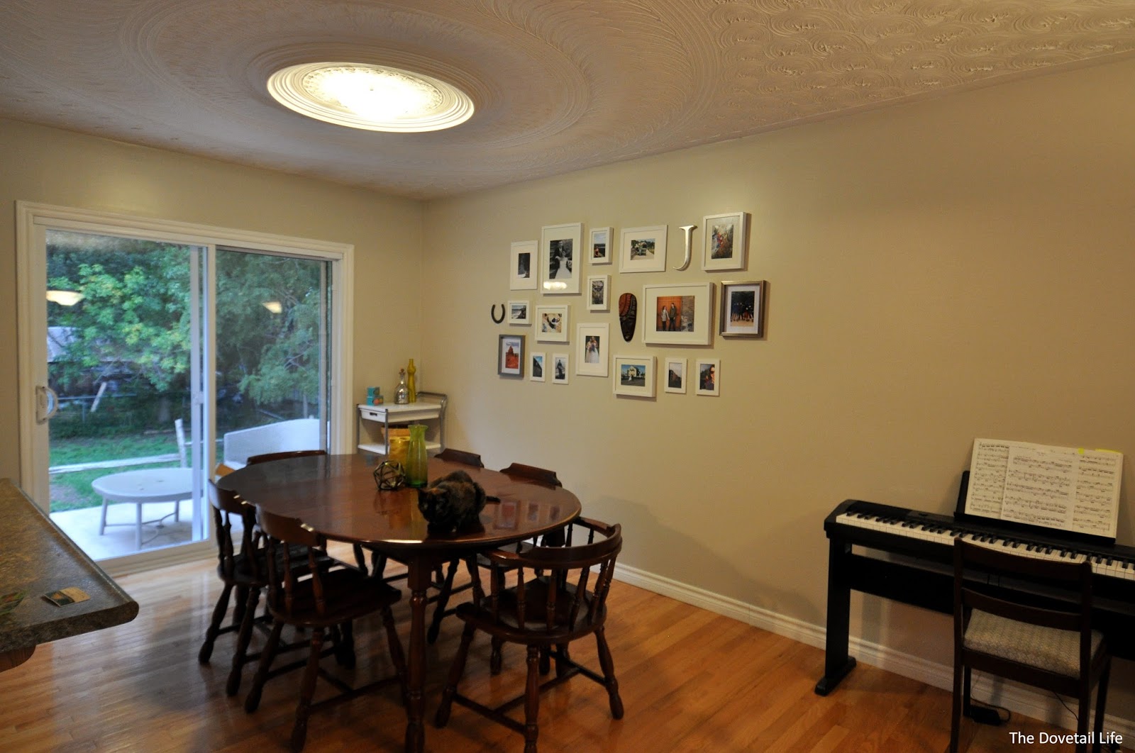
I expanded it a bit for this house by adding the nickel frames that tie in with some artwork we have on the wall across from it and the mirror hanging in the living room. I also changed out a few of the photos.


It takes a couple of hours to hang, but here’s how I tackle it:
-          Frame all of your pictures first
-          Lay the frames out on a surface similar in size to your wall (I use the dining room table, which is a bit small)
-          Cut out pieces of paper the right size for each and every frame (I use old flyers…)
-          Starting from the middle, tape the paper guides to the wall with roughly measured spacing (tip: if it’s a freshly painted wall, use delicate surface tape)
-          Once you’re happy with your placement, you can start hanging the frames over top of your paper guides (this is where I get out my ruler and level to make sure everything is spaced and hung neatly)
-          Pull the guides out from under your pictures once you’re done

Laying out the gallery wall

Hanging the paper guides for the gallery wall

We are completely smitten with this wall (and so is our kitty, Peanut Butter)! So many wonderful memories.

Peanut Butter the cat sitting in front of the gallery wall

13 August 2015

Choosing colours and paints

We decided pretty much immediately that the first thing to go had to be the blue paint that covered 75% of our walls (see the "Before" pics in our House Tour). The outside of our house is blue, and most of the inside is too (including some trim, oof). Way. Too. Much. Blue. But, what colour was going to replace it? This grainy cell phone pic shows just how many paint chips I brought home (and this was after I pitched some a few days earlier):

Paint chips

The chip in the bottom left is the one we chose for most of the house (it will cover most of the parts that are blue). It's Olympic's Tightrope (middle of the chip), but we've had it colour matched to Para Lifestyles. It's very similar to the colour we had throughout the old house. Old habits die hard, I suppose. 

The second from the left on the bottom is Para's Snappy Dresser (second from top on the chip), and it's what we chose for the kitchen walls. It looks really close to Tightrope in this pic, and it definitely is, but it's more green. I wanted it for the main house, but Justin wanted something a bit warmer so Snappy Dresser was relegated to the kitchen. I'm not 100% sold on it for in there, but I just love the colour. We'll see. The big white chip is Valspar's Du Jour, and we plan to paint the kitchen cabinetry with it. 

The blue Para chip is for the master bedroom and bathroom. It's blue, I know, but I just couldn't get it out of my head. We'll be putting Book Worm (second from top) in the bedroom, and Sublime (second from bottom) in the bathroom. 

Overall, I'm going for muddy colours in this house so far. I might change my mind - the only colour that's been purchased so far is Tightrope - but I'm feeling pretty confident in the direction things are going colour-wise. I want it to feel cozy but not frumpy or old; modern, but not too trendy. I want it to be comfortable. 

You'll also notice that I don't concern myself too much with the brand when I'm choosing colours. We've used Valspar, Behr, Olympic, and Para paints in the past. We know now what we like and don't like (paint and primer in one = not for us), and we also know that any of them can be colour matched to the other. We really loved Para Lifestyles when we used it in our last house, and a year and a half after painting, it still looked brand new, so we'll be going that route again. 

Wish us luck on all this painting - as we're starting, I'm realizing just how much bigger than our old house this one really is (which was the point of moving, but still, it's taking much longer than it used to)! 

11 August 2015

We've moved in!


Both to our new home and the blogosphere.

On July 4, my contractor husband, Justin, and I moved into our second house – the blue house – with grand plans to turn it into our long-term, (almost) dream home. With that came the idea to blog about it. This is not our first rodeo: we bought and moved into our first home in 2011, and spent the last 4 years bringing it back to life. We always knew that wasn’t going to be our last home though, so everything was done carefully with resale in mind. This time, we get to do things for us, and we couldn’t be more excited!